


If you’ve moved into a new home, chances are you’ve also acquired someone else’s color palette. Maybe it’s builder-grade beige, stuck-in-the-70s avocado and harvest gold, or a bold teal and orange that isn’t your cup of tea. Or perhaps you’ve lived in your home for a while and decided that it’s time to freshen things up with a new color scheme. Either way you’re faced with what can seem to be a huge question: how to choose colors that will look good together in your home. With a little color know-how, it’s easy to create a color scheme that feels cohesive and coordinates with your space.
A Quick Color Glossary
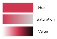
Before we jump into creating a color scheme, it can be helpful to learn a few common color terms. What we refer to as “color” is made up of three separate components: hue (which color something is), saturation (how vibrant and pure a color is), and value (how light or dark a color is). A neutral color refers to either an entirely desaturated color like black, white, or gray or a color with very low saturation like brown, beige, near-gray, or off-white.
Common Color Schemes
Color schemes are described in terms of the relation of colors to one another on the color wheel. To create a color scheme, pick a base color that you would like to use in your space then use the following rules to find other colors that will coordinate well with it.
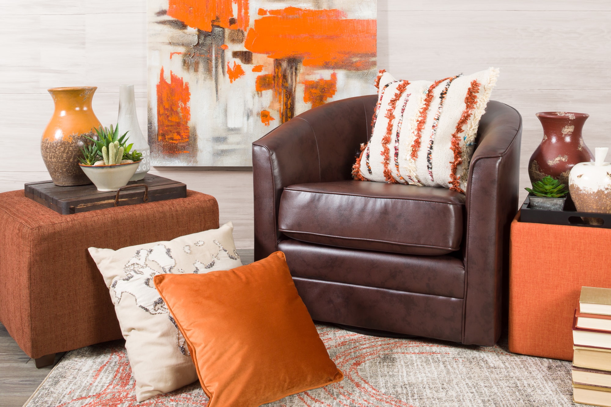
Monochromatic: A monochromatic color scheme uses different tints (color + white), tones (color + gray), and shades (color + black) of the same hue, like a pale sage green, a vibrant apple green, and deep forest green. This color scheme provides a great way to show off different materials and textures, making it an especially good choice when creating a sophisticated look with neutrals.
Here, vibrant orange in the storage ottoman, pillow, and wall art works with orange-leaning creams in the other pillow and rug as well as the deeper rust and brown of the cube ottoman, vase, and chair.
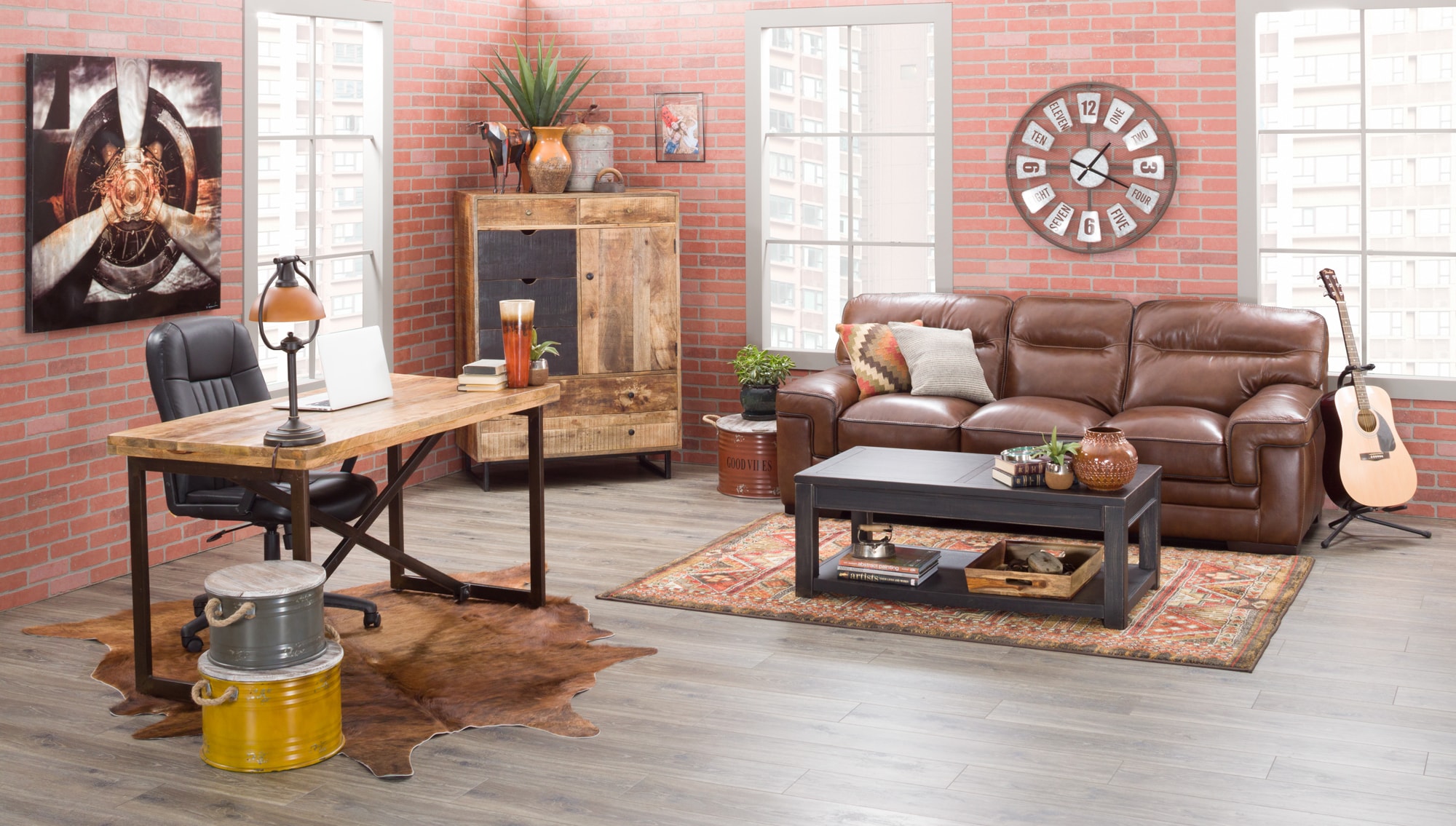
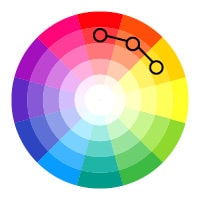
Analogous: An analogous color scheme is made up of 2-4 colors next to each other on the color wheel like red, orange, and yellow. It’s easy to put together and creates a harmonious feel.
In this example, the brick red walls coordinate with the deep brown of the sofa, the red, gold, and brown tones in the rug, and the rust, orange, and amber of the accents.
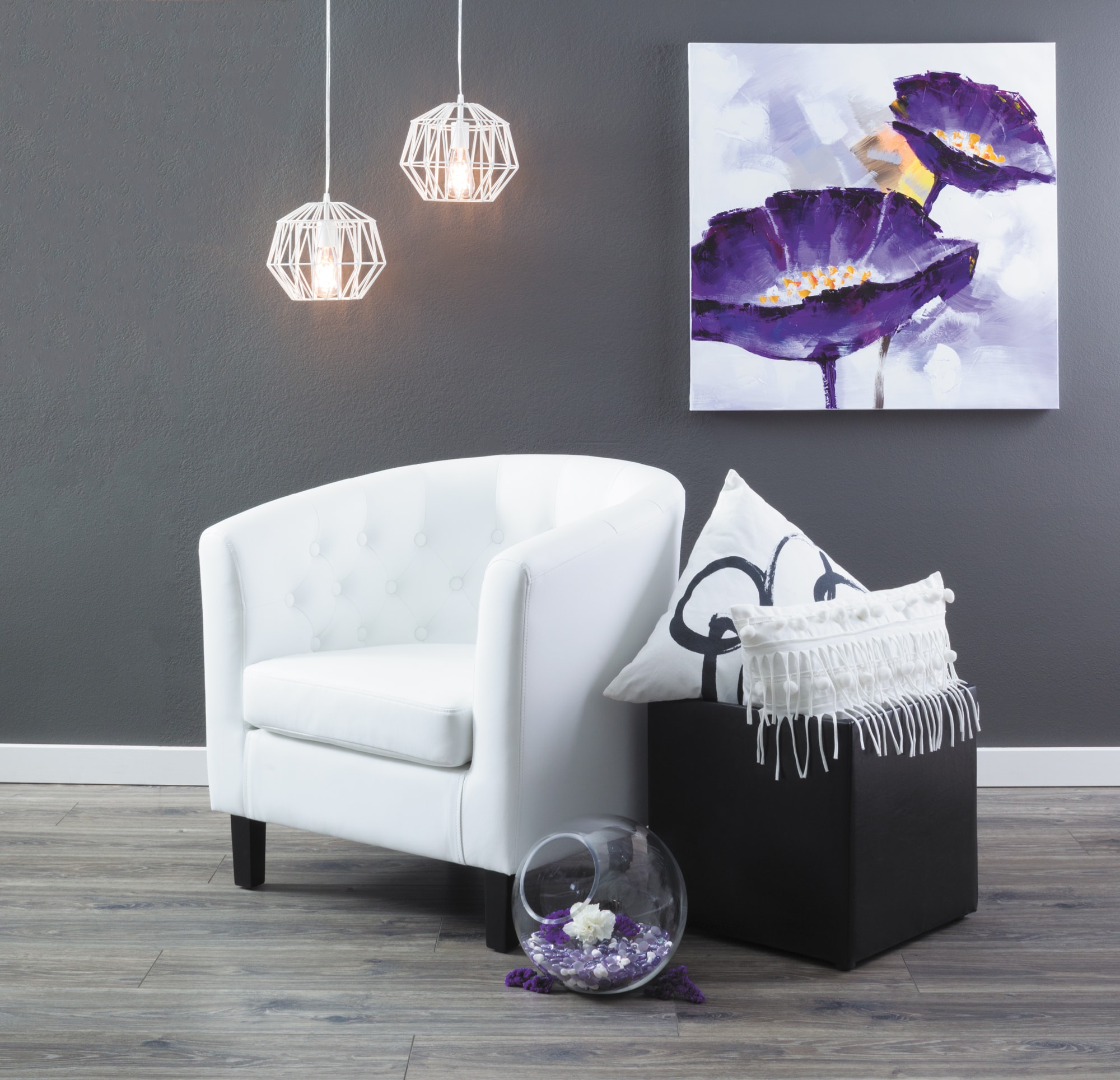
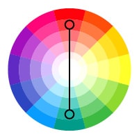
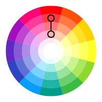
Complementary: A complementary color scheme incorporates colors that are opposite from another on the color wheel like orange and blue, red and green, or yellow and purple. It can create a striking and dramatic look, but it has the potential to be overwhelming if you use bold, saturated versions of the coors. Use a less saturated version of one of the colors if you want to tone the look down.
Here, the grey walls and the white tub chair allow the dramatic contrast between the deep purple and rich yellow-gold in the wall art to take center stage.
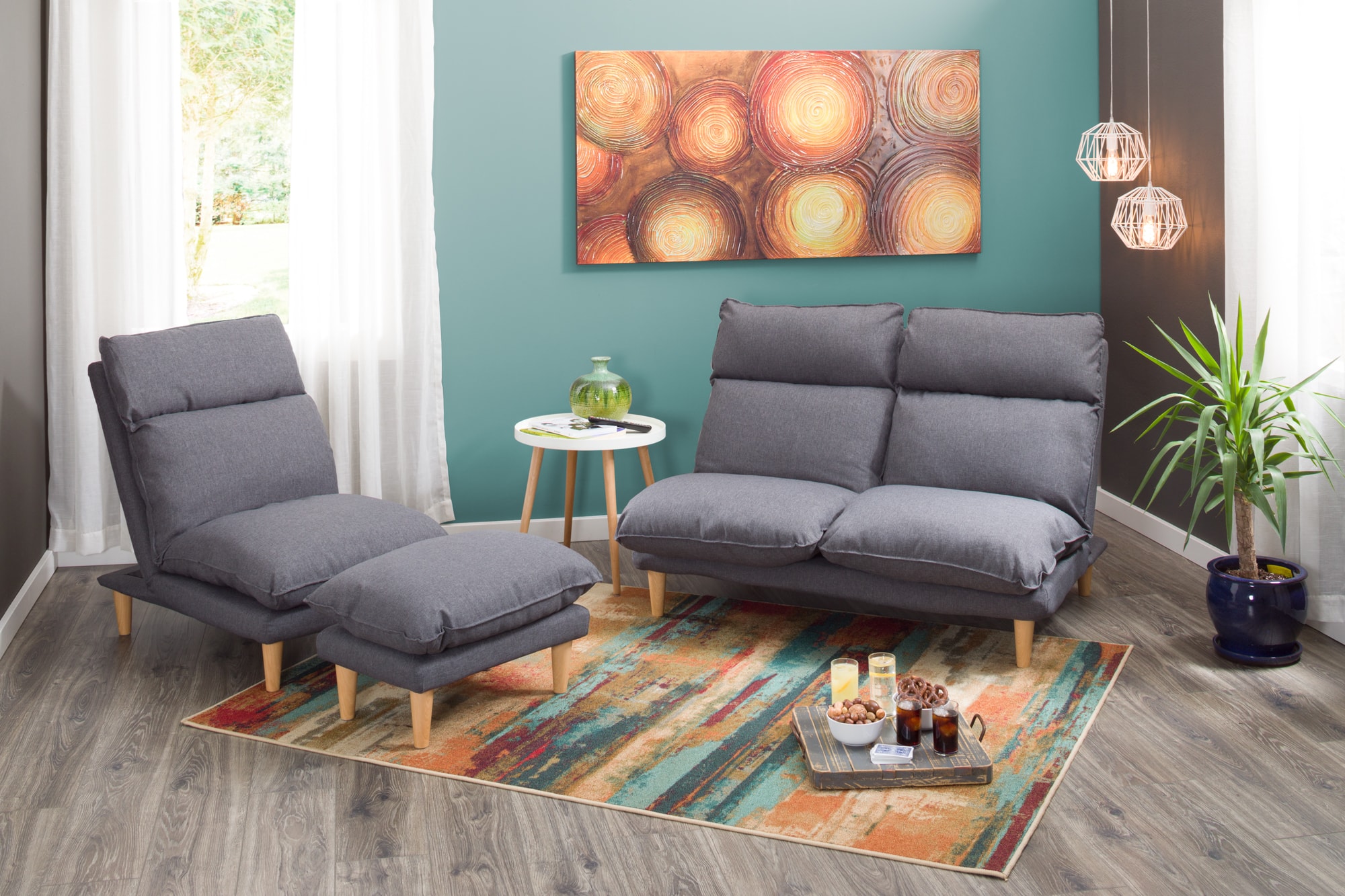

Split Complementary: A variation on a complementary color scheme, a split complementary color involves a base color and the two colors next to its complement on the color wheel, like red paired with teal and yellow-green, blue with yellow-orange and red, or yellow paired with blue and purple. It can offer a more subtle and nuanced look than a purely complementary color scheme.
In this example, the teal wall pairs with the orange, red, and teal in the rug to create understated contrast while the gray loveseat, chair, and ottoman provide a neutral place for the eye to rest.
Adding Color to a Room
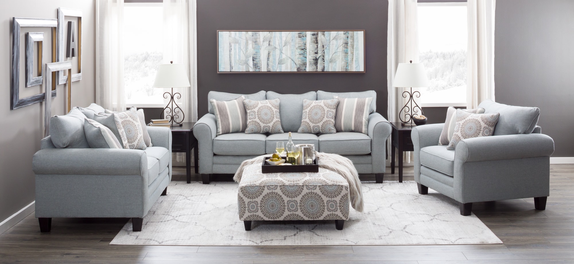
Once you’ve settled on which combination of colors you want to use in your space, it’s time to figure out how much of each color you want to use. A common interior design rule of thumb is the 60/30/10 rule, where you use 60% one main color, 30% a secondary color, and 10% an accent color. In a room, this typically works out so that the walls are your main color, the furniture is in your secondary color, and accessories like pillows, artwork, or accent furniture pull in your accent color. You can play with the formula a bit to incorporate a second accent color as well. Here, the gray walls provide the main color, the sofa, loveseat, chair, and artwork provide a light blue secondary color, and the ottoman, lamps, and rug introduce ivory accents.
Accessory Color
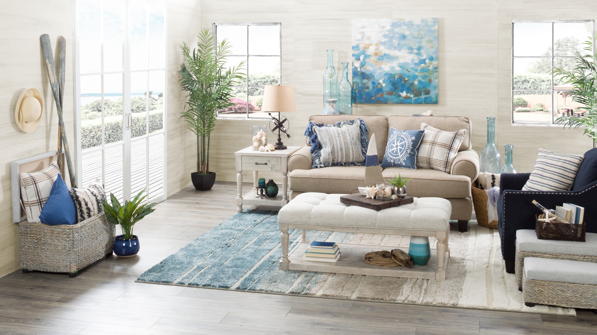
When it comes time to add accessories to your space, there are two main strategies: using them as a pop of color or incorporating accessories in the colors that follow your larger color scheme. If your room is predominantly neutral you can use accessories to add a pop of color. If you used color in your room, use the 60/30/10 rule with your accessories as well to continue your color scheme through the entire space and create a cohesive look. In this example the walls and most of the furniture are neutral, while the accent chair, rug, pillows, wall art, and decor items bring in a splash of blue.
Other Starting Points
While you now know how to create a color scheme from scratch, it can still be hard to pick a place to start. Try using a favorite piece of artwork, a rug, or even your wardrobe to pick a starting color or two—you already know that you like those colors and chances are they work well together. Considering the function of the room is also a good place to start because colors have different psychological effects and associations that you can use to create your ideal atmosphere.
Creating a color palette that works in your space doesn’t have to be overwhelming. Simply start with a base color, choose a color scheme, and then use the 60/30/10 rule to figure out how much of each color you should use in your space. Following these guidelines will help you use color to create a beautifully color-coordinated space.